Spaces International
Charity and social enterprise for social inclusion, its site rebuilt around three real audience personas.
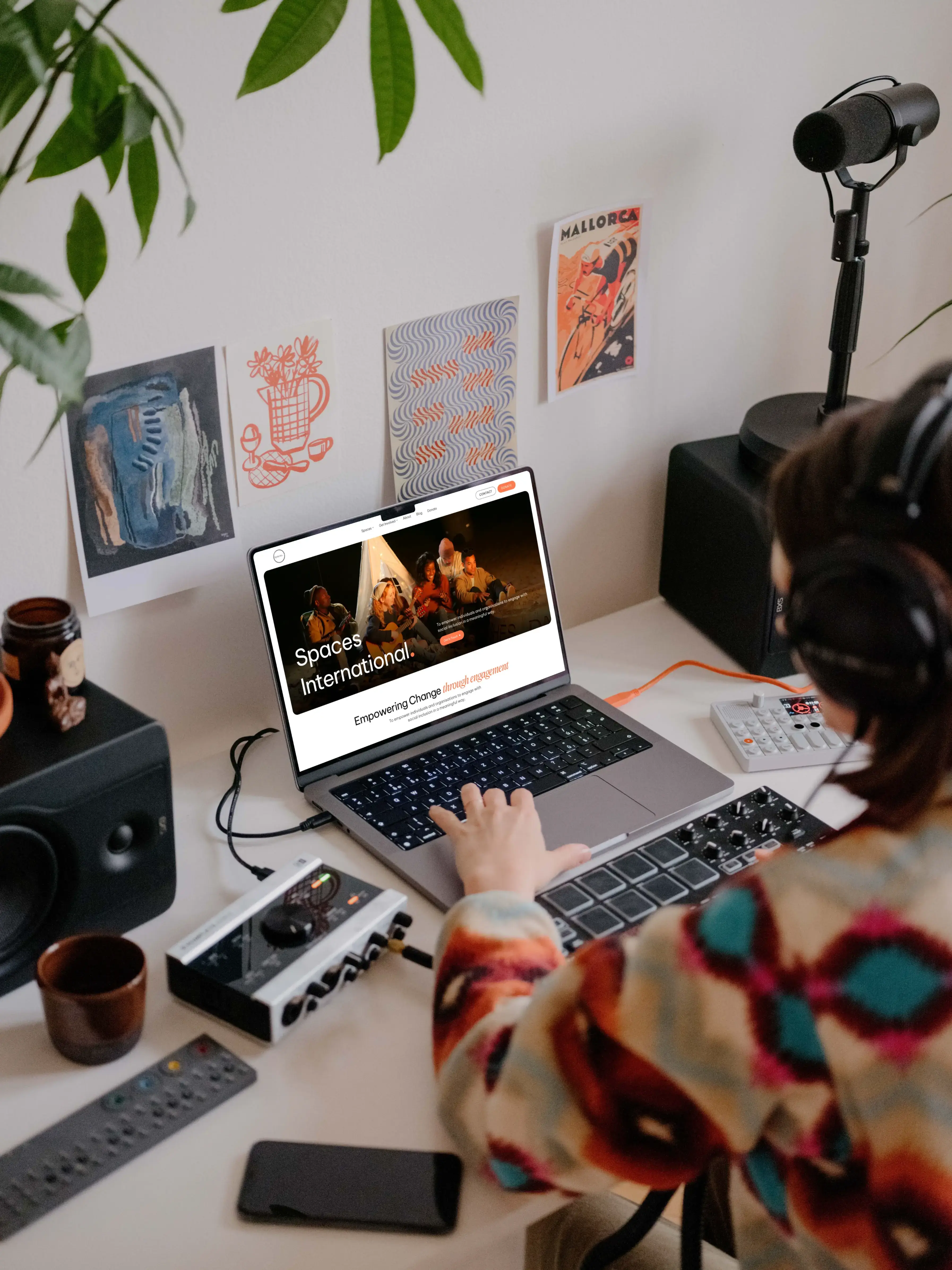
Overview
Spaces International is a charity and social enterprise built around social inclusion, working through three initiatives: Safe Spaces (listening to lived experience), Transformed Spaces (helping organisations become more inclusive), and Open Spaces (helping people launch business ideas). In their own words, their vision is to empower individuals and organisations to engage with social inclusion in a meaningful way.
I worked on content strategy and page copy for their website redesign, starting from three personas the client's own team had already built, one per initiative. The work ran February through May 2024 and covered the homepage, all three initiative pages, About Us, Get Involved, and Contact Us.
TL;DR
Spaces International's existing copy explained the organisation reasonably well, just outdated. The harder problem: three distinct initiatives, three very different audiences (a school counsellor, a corporate CEO, an aspiring entrepreneur), all needing to read as one coherent charity rather than three programs bolted together. I worked from the client's own personas to write genuinely different content for each audience rather than one generic nonprofit voice repeated three times.
Problem Statement
This wasn't a redesign-from-crisis situation. The real challenge was structural and tonal: three initiatives under one shared brand, each speaking to a completely different visitor.
A bit outdated, but still explains decently what we do.
— Spaces International, on their previous site copy
- Safe Spaces (Listen): a school counsellor looking for respectful ways to talk about difficult social topics
- Transformed Spaces (Learn): a corporate leader looking for a credible, structured DEI partner
- Open Spaces (Engage): an aspiring social entrepreneur who needs funding, mentorship, and physical resources
Treating these as one audience would have flattened the site into generic charity language. The organisation also had a nuanced position to hold: they support inclusion without promoting any specific worldview, a line that's easy to get wrong in either direction, preachy on one side, noncommittal on the other.
Approach
Refusing to generate content before understanding the full picture
I deliberately held off on writing any copy until I had both the existing site content and all three personas in hand, so the first real content decisions were grounded in audience research the client had already invested in, not a generic nonprofit template.
Treating each persona as its own content strategy, not a relabeled template
Safe Spaces leaned into discussion formats for a school counsellor; Transformed Spaces leaned into consulting access and measurable frameworks for a corporate leader; Open Spaces leaned into mentorship and funding for an aspiring entrepreneur. Each came from that persona's actual goals, not one "get involved" message with the initiative name swapped.
Protecting the client's own words rather than smoothing them
The "Our Beliefs" section kept the client's own reasoning intact (they support inclusion without promoting any specific worldview) rather than flattening it into generic "we believe in diversity" language. Team testimonials, including one contributor listed only as "Identity Protected," were left exactly as given, a hard rule rather than a style suggestion. Get Involved became four parallel doors (Events, Internships, Resources, Hannah Grace Day) instead of one long page trying to cover all four at once.
Showcase
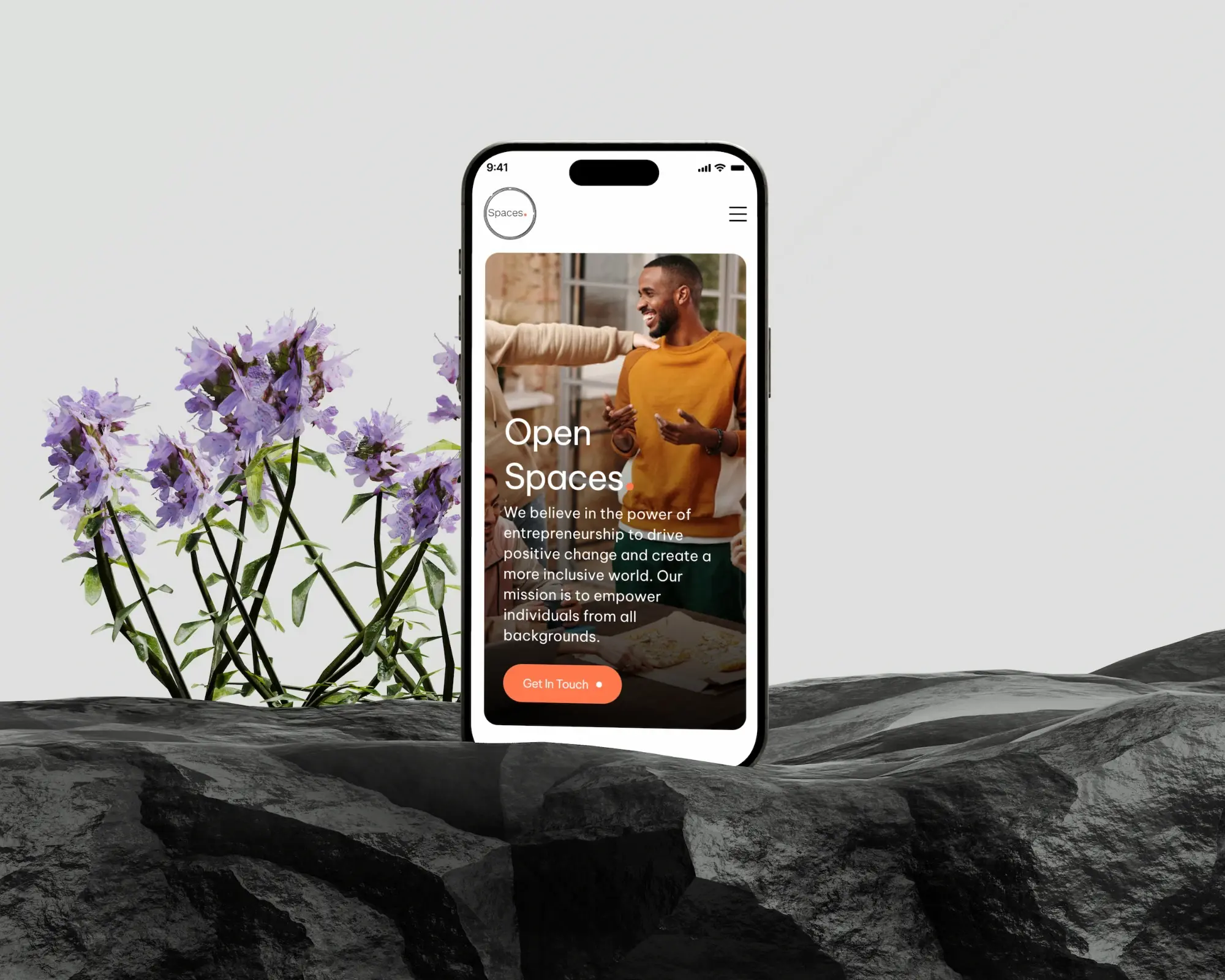

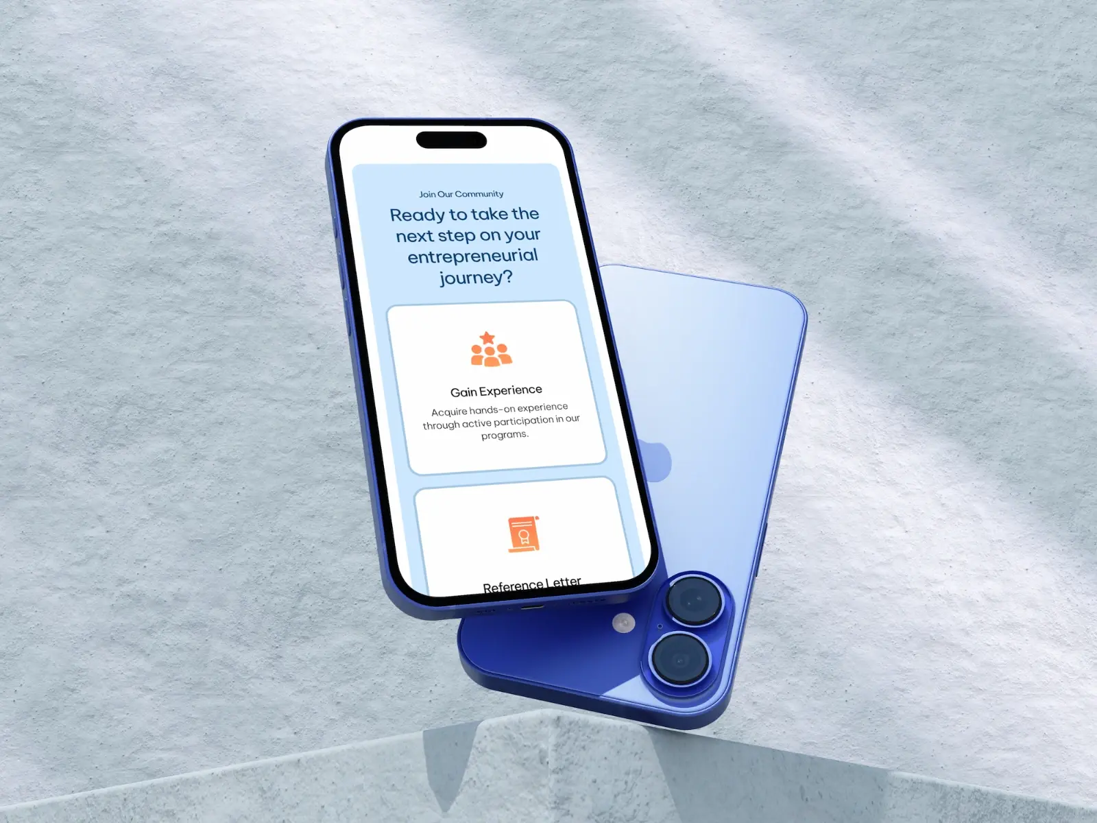
Design System
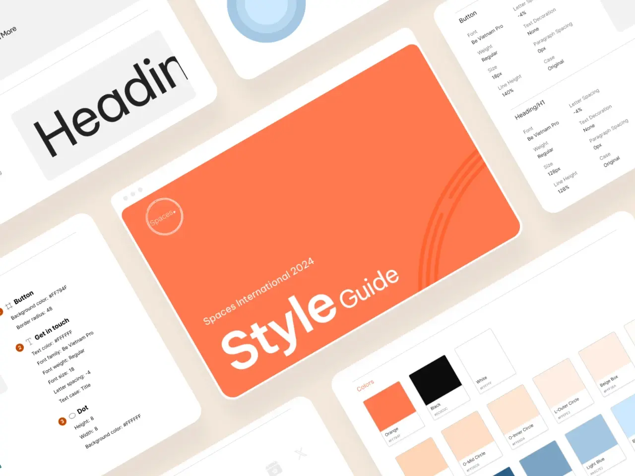
This engagement stayed almost entirely in content and IA, but it did produce one piece of real visual groundwork: a lightweight style guide covering type (Be Vietnam Pro), button specs, and the palette, an orange anchor against black and white with a couple of softer supporting tones.
Conclusion
This stayed almost entirely in content strategy rather than full visual design, so I don't have client feedback rounds or a launch milestone to point to. What I can point to is a complete, persona-matched content structure across the homepage, three initiative pages, About Us, Get Involved, and Contact Us, plus a lightweight style guide that gave the direction a real visual anchor. I don't have launch or engagement data to share beyond that.
The main discipline this reinforced was resisting the urge to generate content before understanding who it was for. "One brand, three audiences" is a genuinely different problem from "one brand talked about three ways": a school counsellor, a founder, and a CEO need different proof points and different levels of formality, even under one shared mission.