Arc Studio
Web3 creative agency's own site, redesigned around the literal shape of its name.

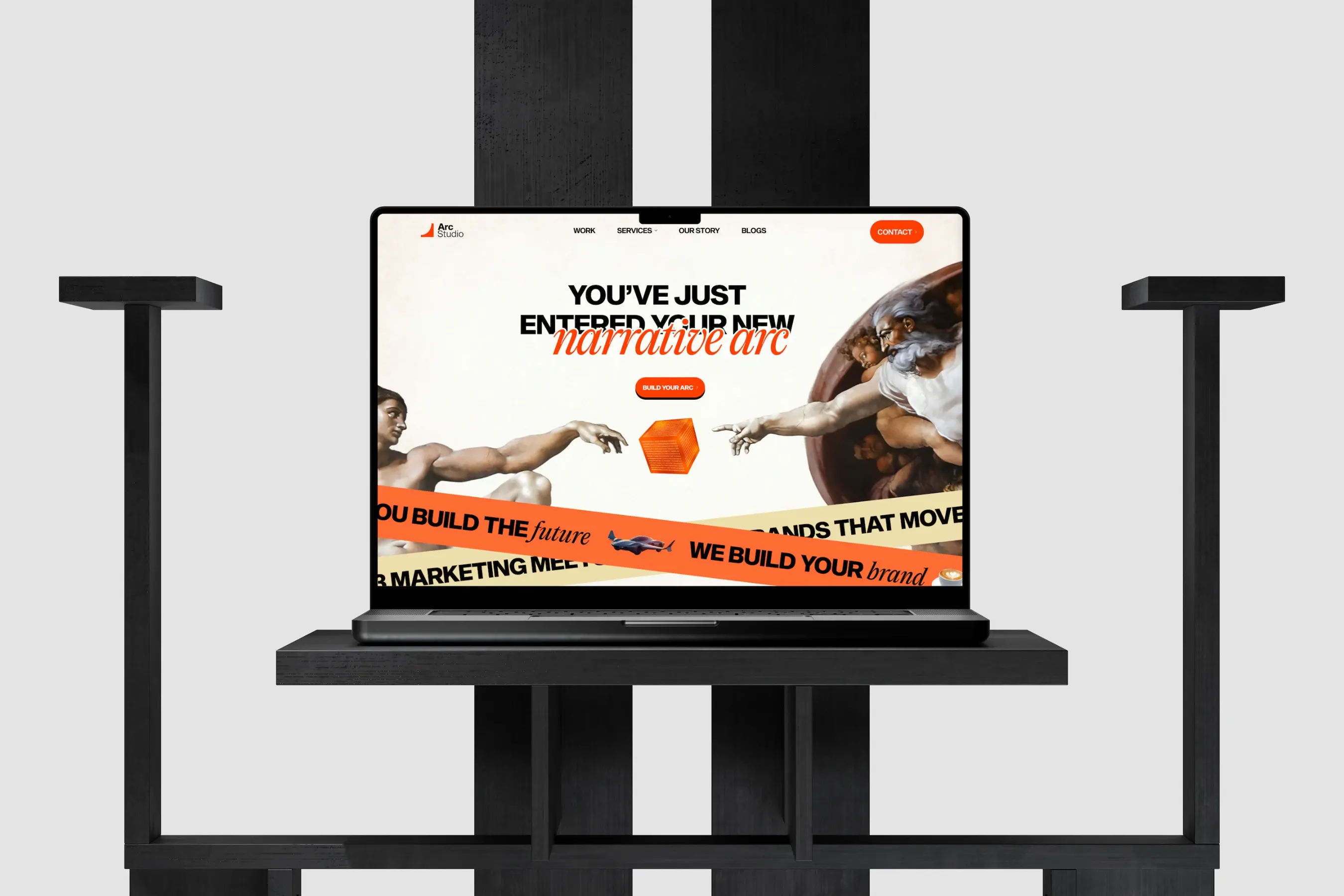
Overview
Arc Studio is a creative agency focused entirely on Web3 and crypto companies, offering branding, podcast production, social media, and website design. This case study covers the agency's own site, not a client project.
I led the design work myself, developing the visual identity, IA, and page templates, working closely with an internal stakeholder who reviewed and shaped the direction throughout. The project started in March 2025 and continued through mid-2025 as internal pages (About, service templates, case study pages) were built out.
TL;DR
Problem Statement
Most Web3 marketing agency websites look alike. Mapping the direct competitor landscape (Coinbound, Lunar Strategy, MarketAcross, Crowdcreate, Serotonin, Coinband) turned up the same pattern everywhere: bold hero statement, client-logo strip, testimonial carousel, services grid. None of it was wrong, but none of it gave a visitor a reason to remember one agency over another.
- A homepage, four service templates, a case study template, an About page, and a blog, all needing to feel like one coherent brand
- A name, Arc, that gave a hook, but not yet a design system to build from
- Ten-plus page types to design against copy that was still evolving
The ribbons felt too heavy, and the colosseum read as meme-ish rather than telling an actual story.
— Internal feedback, on an early hero concept
There was also a practical problem: with ten-plus page types to design and copy still evolving, designing every page from scratch against a moving target would have meant constant rework.
Approach
Instead of treating Arc as a one-line metaphor for the hero section, I used it as the entire creative brief. An arc is also a physical shape across cultures and history: Roman archways, Japanese torii gates, the arc of a falling apple, the curve of a story, a source to pull from for nearly every page rather than inventing a new concept each time.
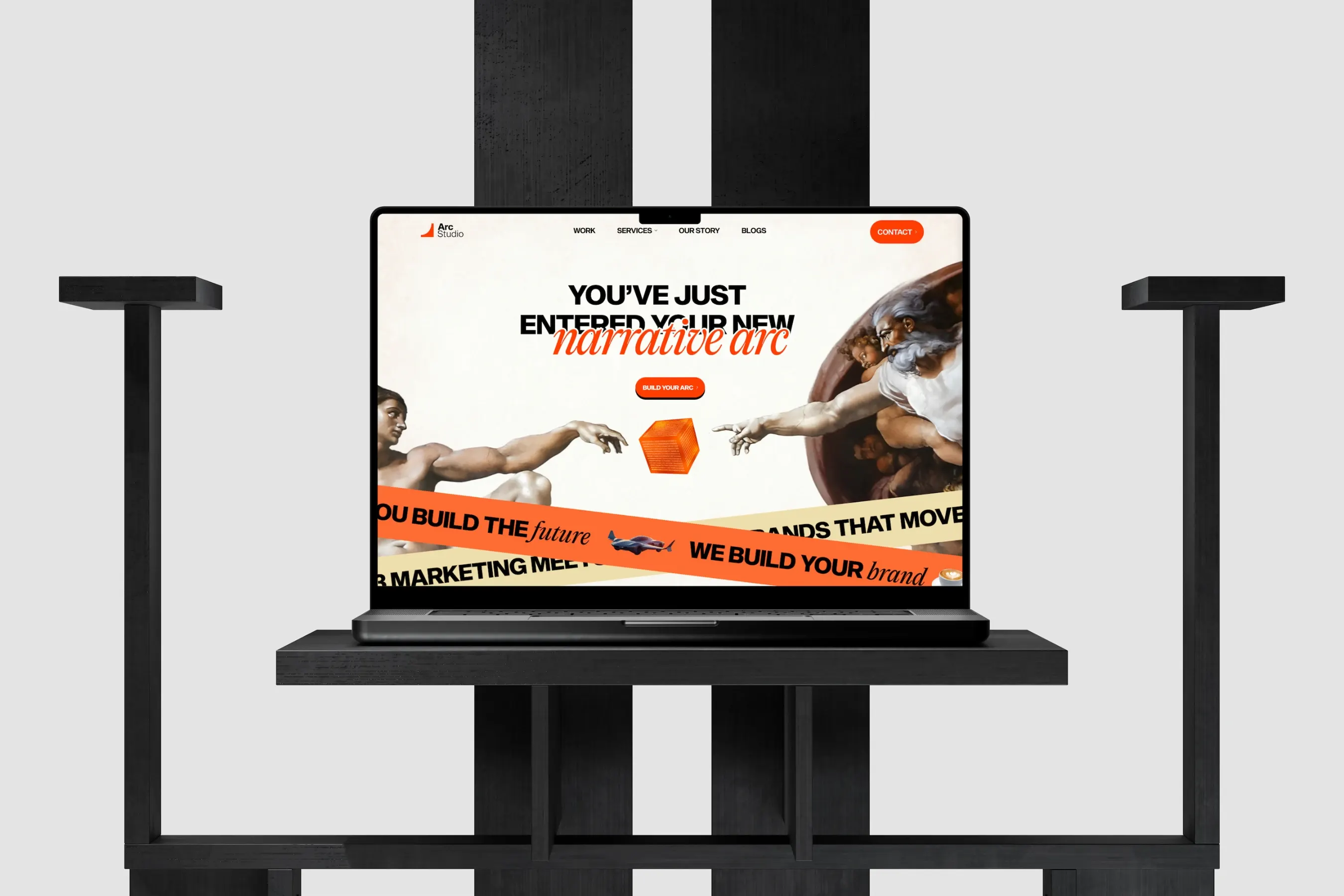
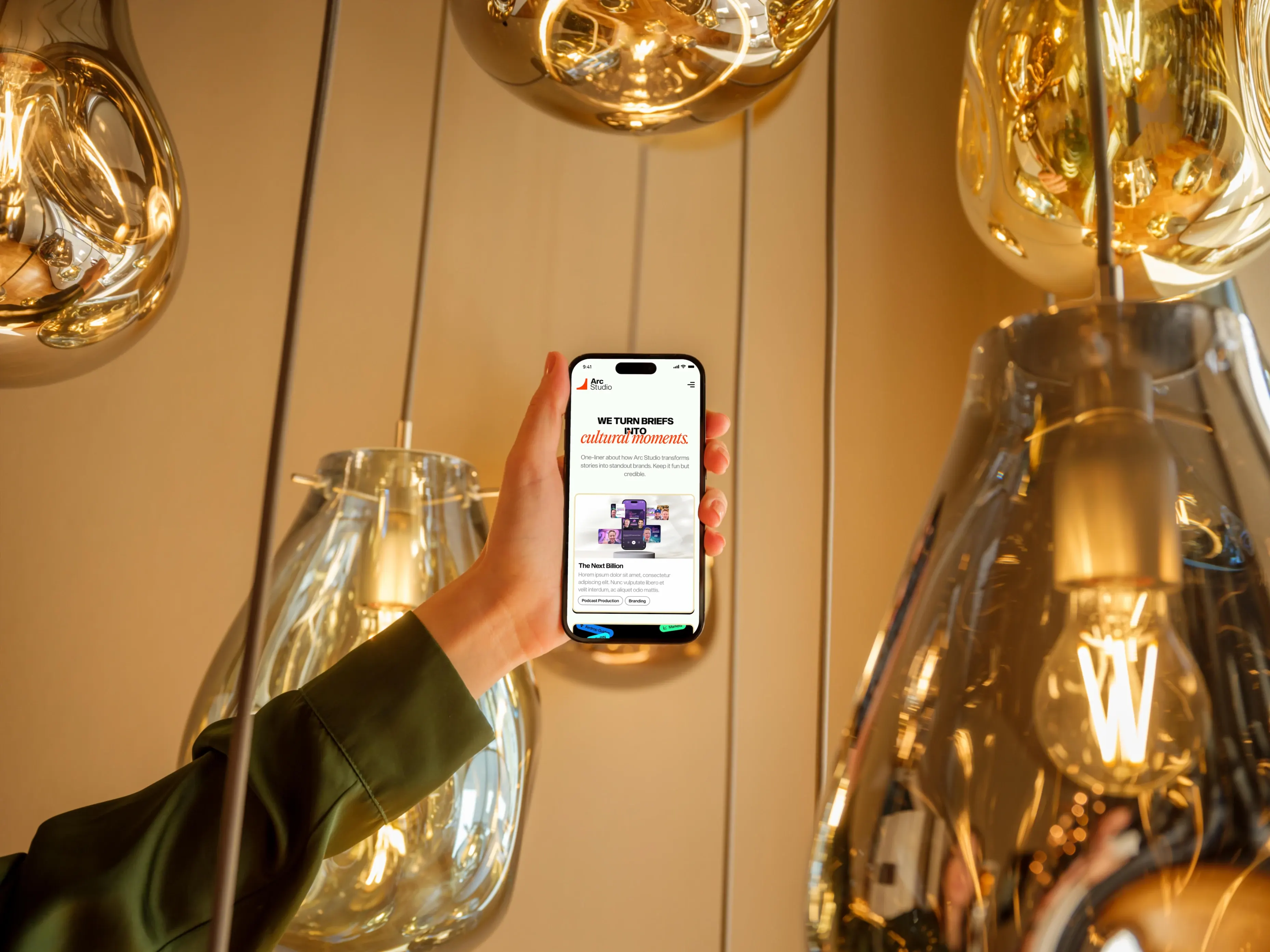
An early hero version used heavy orange marquee ribbons alongside a colosseum image, but that didn't survive feedback. What stuck was the Arc de Triomphe itself as the hero visual, its arch masked so scrolling creates a parallax effect of moving through it, literally walking the visitor through the arc. The agency's own name became an interactive piece of the page instead of just a word in the logo.
Showcase
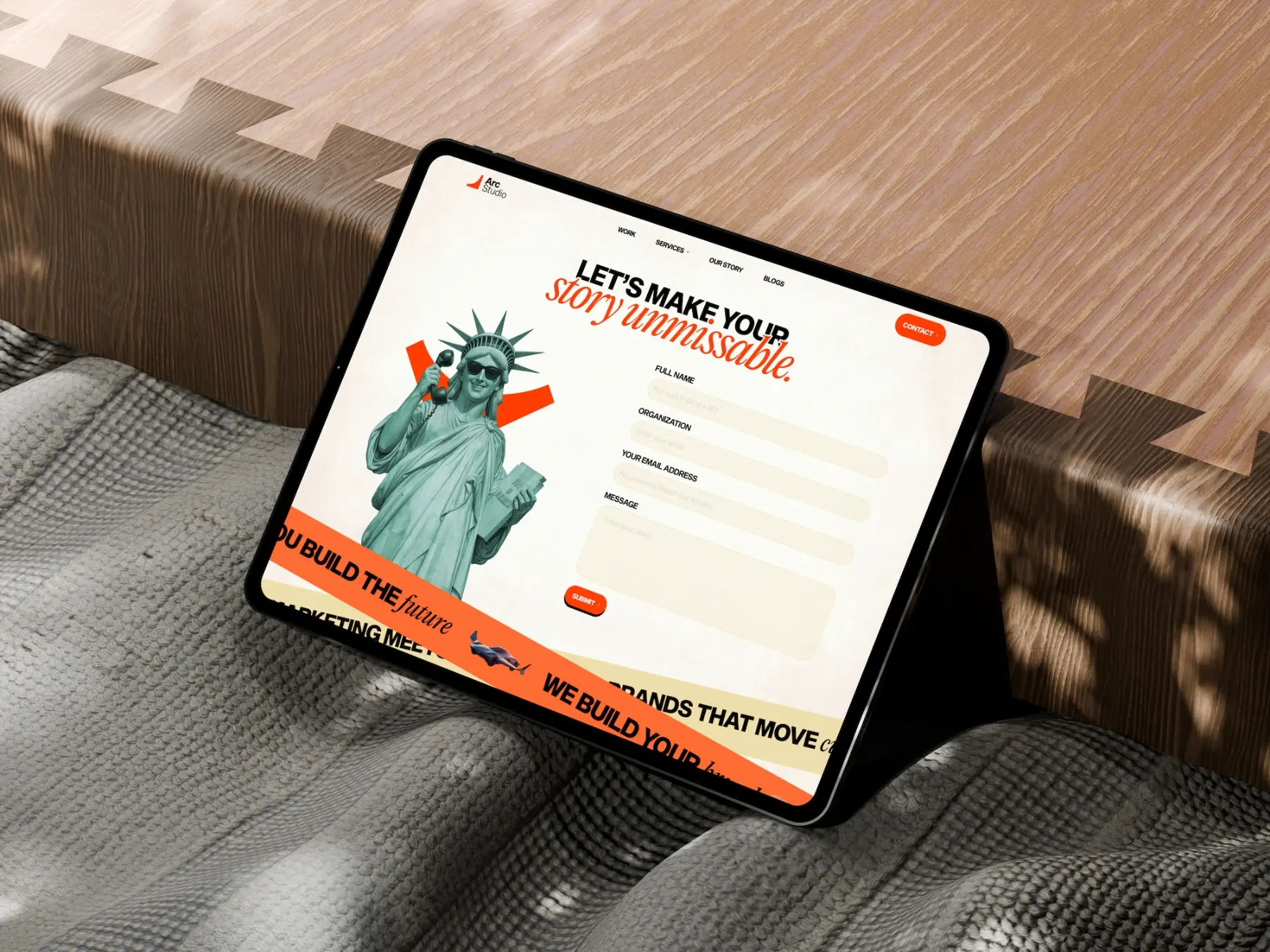
The orange accent came under scrutiny more than once for being visually too strong, particularly in ribbon banners and background blocks. Rather than abandoning it, since it stayed the throughline accent across the site, I moved to a lighter shade wherever it was overpowering the content around it.
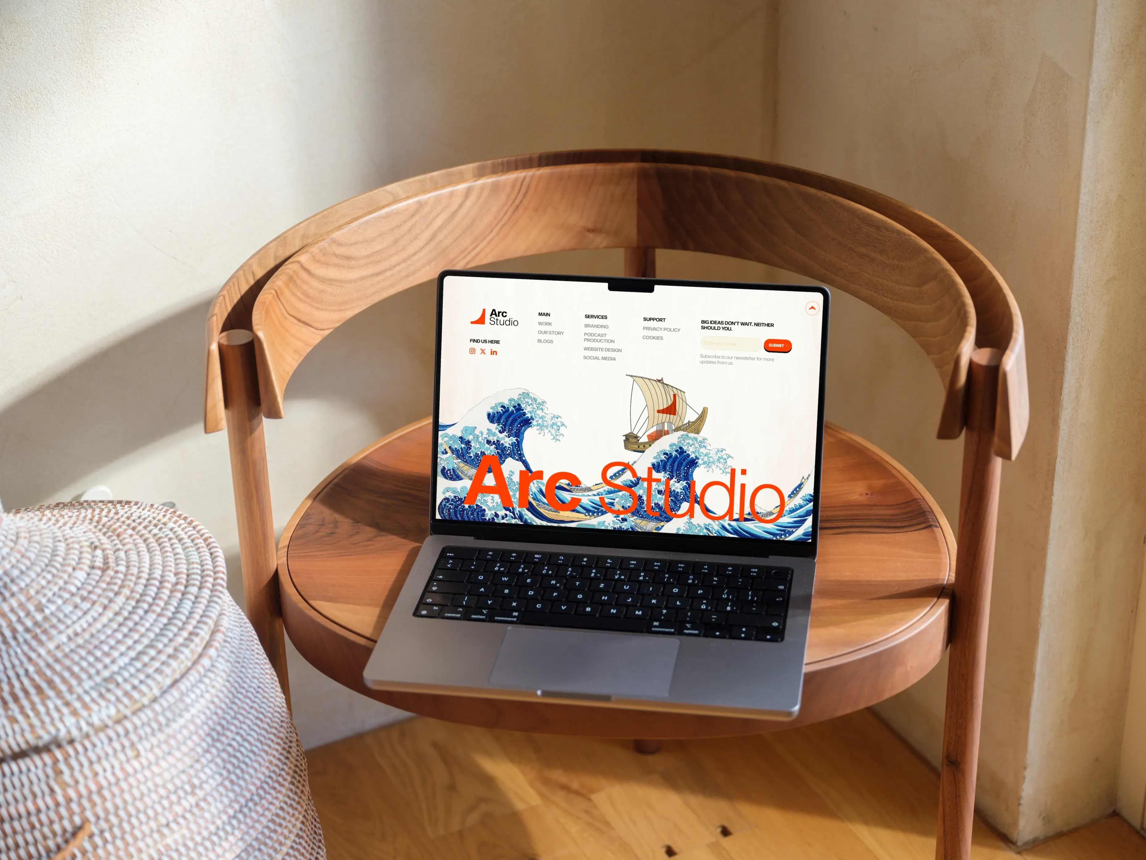
For the About page, the brief was handwritten notes from a call: Japanese gates, arcs, Newton, cave art from India, no religious notes. I turned that into a structured, section-by-section image brief: a torii gate as a portal motif in the hero, a Roman archway merging into a torii gate for the blend of cultures, a modernized Newton's apple tree with an orange apple falling toward an arc, and Indian cave art transitioning into digital linework, deliberately avoiding any religious iconography as instructed.
Design System
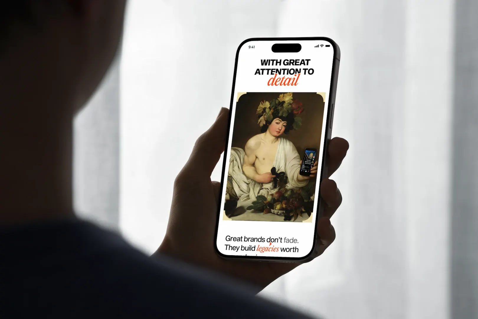
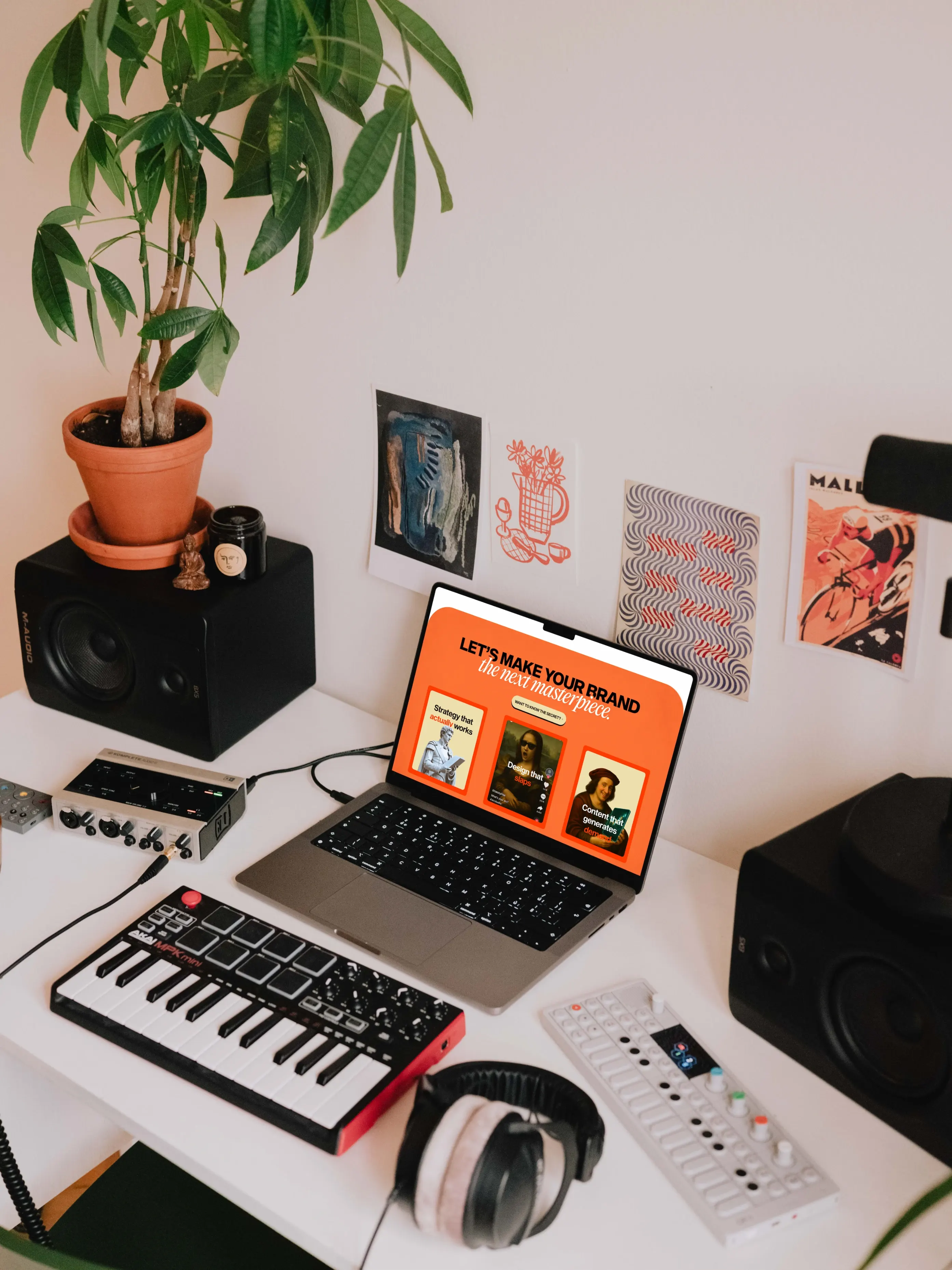
Rather than custom-designing four separate service pages, I built one repeatable structure (hero statement, service breakdown, the Arc Studio edge, selected work, FAQ, CTA) and applied it to branding, podcast production, website design, and social media, changing only copy and supporting visuals per page. The case study template followed the same logic: a consistent challenge, approach, results, gallery structure across every client project.
For internal pages, I laid out the intended content structure first, sent it ahead of final copy, and only moved into visual design once real copy existed against it, so the design work wasn't chasing a moving target every time messaging changed. For Work and Case Study specifically, I used a studio called Off-Mind's site as a structural reference for its challenge-to-results flow, then rebuilt that flow in Arc Studio's own classical-meets-digital language rather than copying its look.
Conclusion
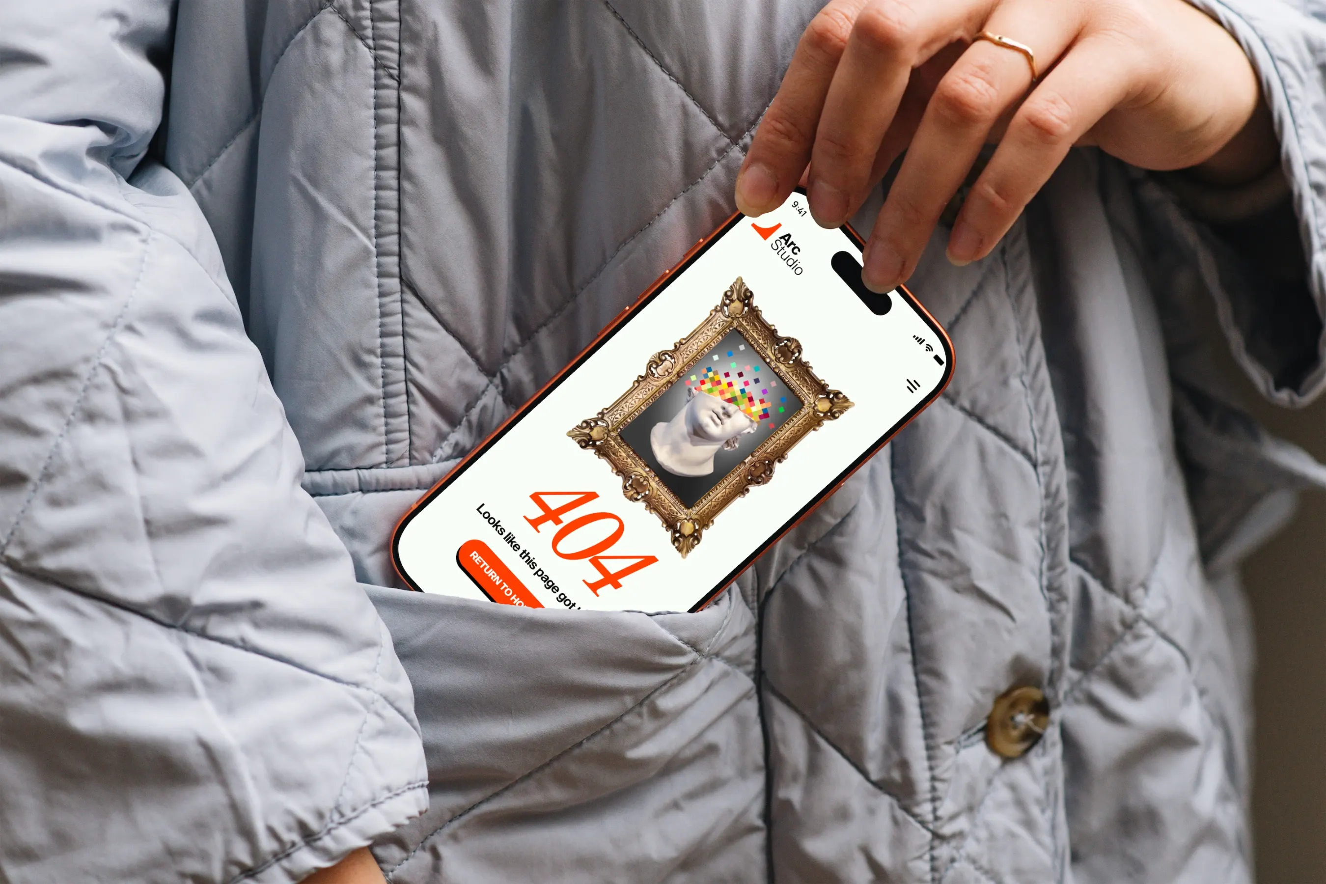
The clearest checkpoint: after the hero and homepage iterations, the internal stakeholder confirmed the final design was approved, with only copy adjustments and small image swaps requested afterward, not another structural round. The same visual language (classical art references, the orange accent, the tone of voice) held up well enough to be reused across service page templates and the About page months later, suggesting the identity worked as an actual system. I don't have launch dates, traffic, or lead numbers for the live site, so I'm leaving out a performance claim.
The main thing this project taught me was to take a name seriously as a design constraint, not a marketing throwaway. Once arc became a literal, physical shape with real historical range to draw from, almost every design decision had somewhere to start from instead of a brand-new concept invented per page. The other real skill exercised was translating loose, informal input into a structured, page-by-page art direction brief, closer to editing someone else's half-formed instinct into something buildable than generating ideas in the abstract.