Migrateful
UK charity training refugee and migrant chefs to teach cookery classes, rebuilt to read as premium rather than a typical nonprofit.
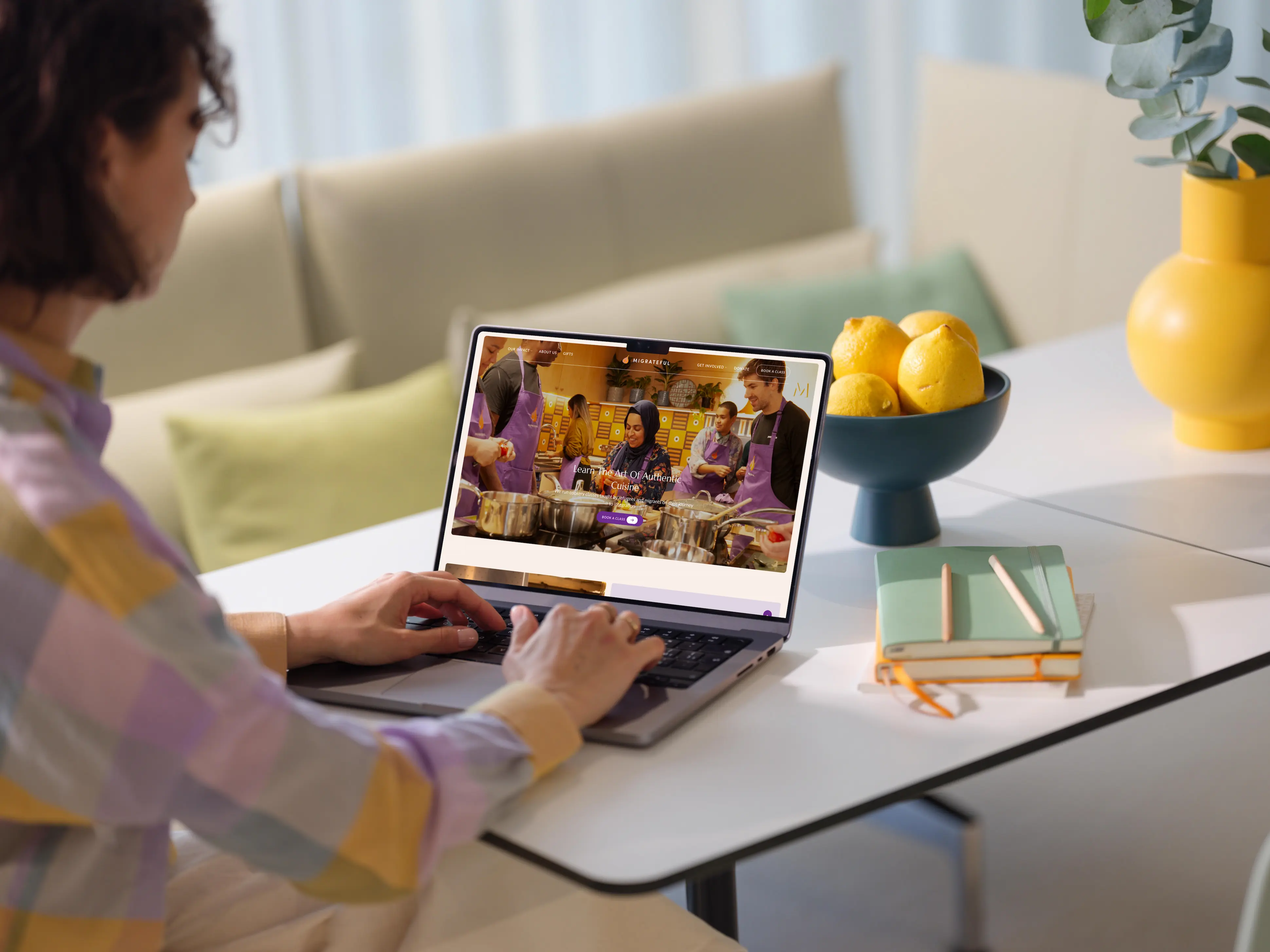
Overview
Migrateful is a UK charity that trains refugees, asylum seekers, and migrants to teach cookery classes, helping them toward employment and integration. Founded in 2017, it has since supported 79+ migrant chefs across more than 3,000 classes.
I worked on the website rebuild as part of a small team, covering content strategy, page copy, and layout direction across the homepage, About Us, Meet the Chefs, Our Impact, and Donate. Their old site, 152 pages and 51 plugins deep, had broken down under its own complexity and needed a clean rebuild.
TL;DR
Problem Statement
We are not a charity with lots of photos of us smiling in church halls, we are a slick professional company, and that is why we can charge a lot because our product is worth a lot.
— Migrateful
That's a real tension for a charity site to hold: premium enough to sell a £140 class, still an honest nonprofit underneath. The client's own instructions were specific, not vague brand talk.
- Photography closer to a high-end hospitality brand than typical charity imagery
- No white saviour framing, chefs and staff read as one team
- Homepage stays apolitical, so the blog moved off it entirely
- No UK-specific slang, the audience is international
Approach
The client had already reviewed comparable sites (Migration Matters, Settle, Breaking Barriers, Kerb) with specific, itemized reactions, so I worked from those concrete likes and dislikes instead of starting visual research from zero. Early structural drafts had the homepage competing for attention across chefs, classes, volunteering, and donations, which I simplified to one strong hero image and one clear action, book a class, with everything else moved to supporting sections.
Chef bios and testimonials came from real submissions, trimmed to a consistent, readable length rather than written from scratch. One early open question, serif versus sans-serif headings, got resolved by direct client feedback rather than the more generic "modern nonprofit" default, and serif stuck.
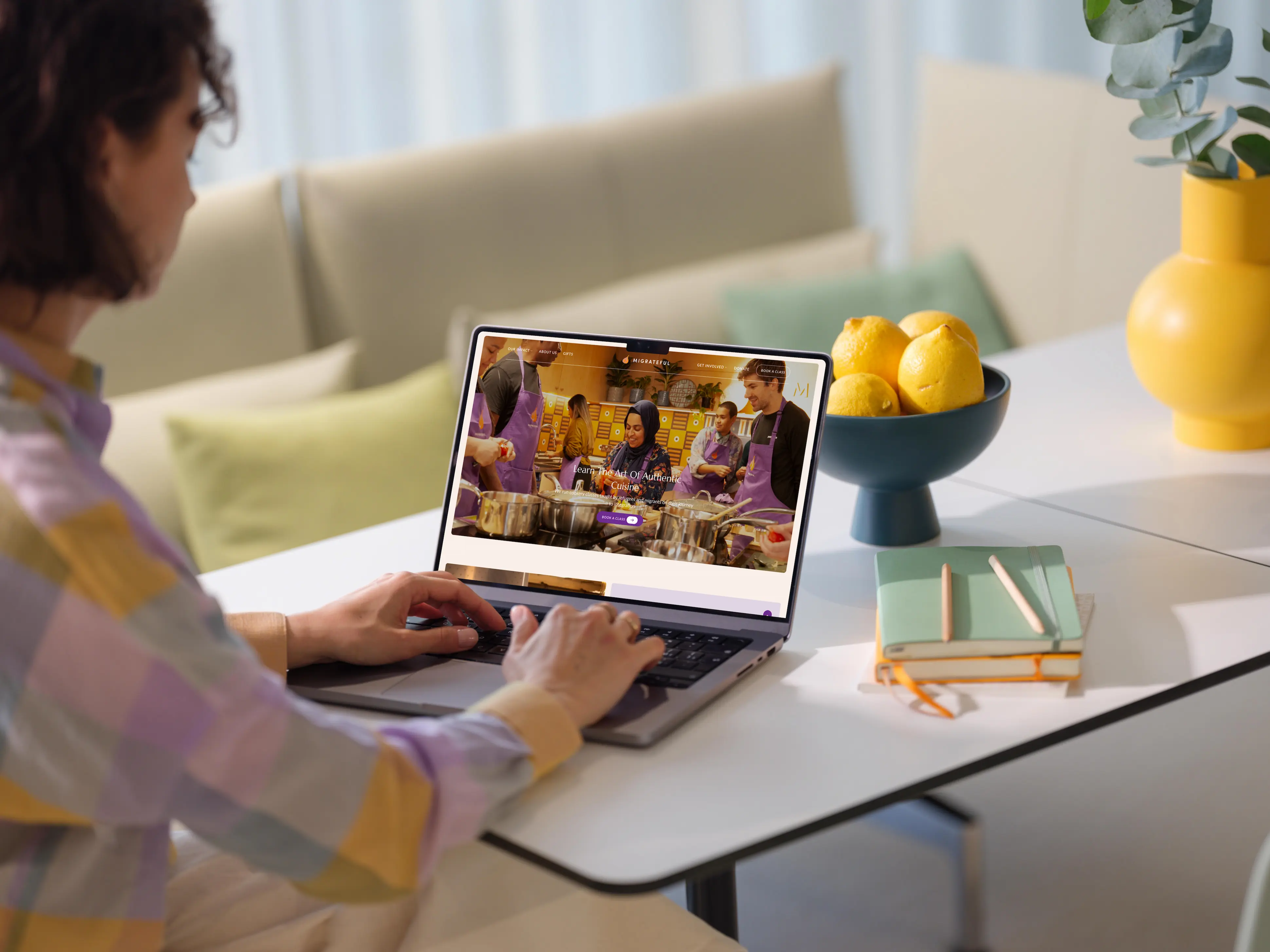
Showcase
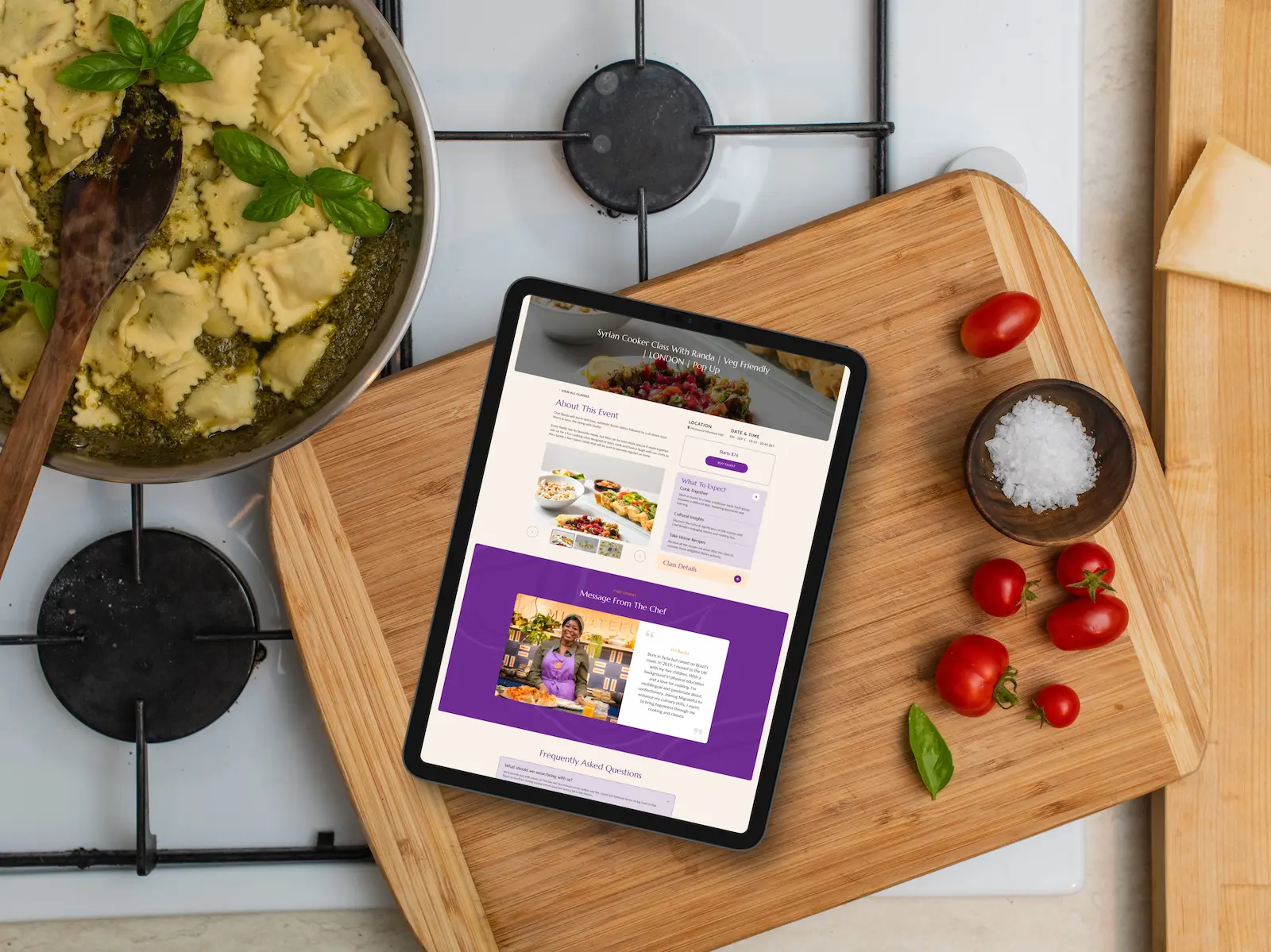
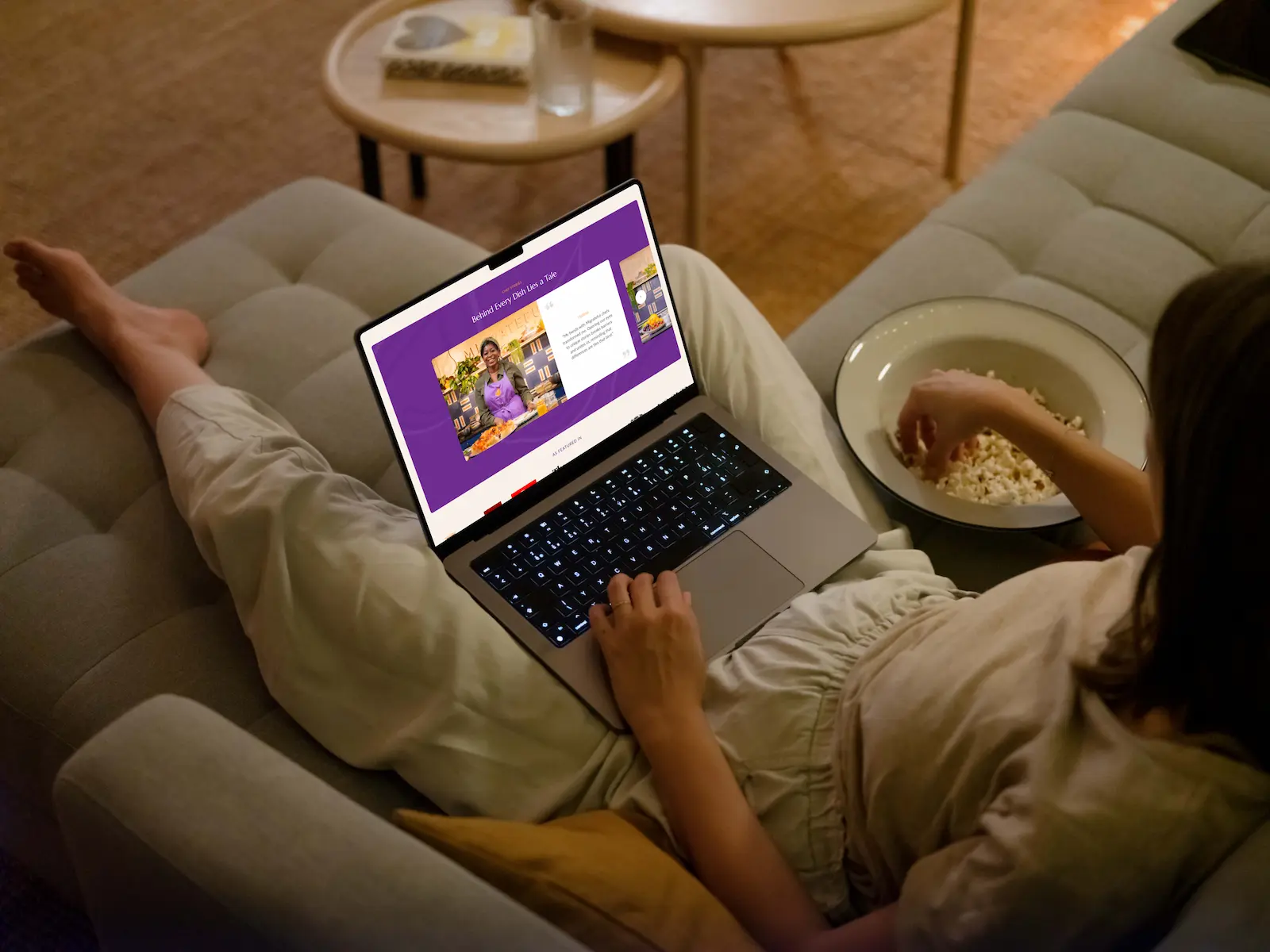
The site had to serve four different audiences, the public booking classes, businesses arranging private events, volunteers signing up for shifts, and the internal team updating content, so pages like Meet the Chefs needed to support both storytelling and a direct booking action at once.
Design System
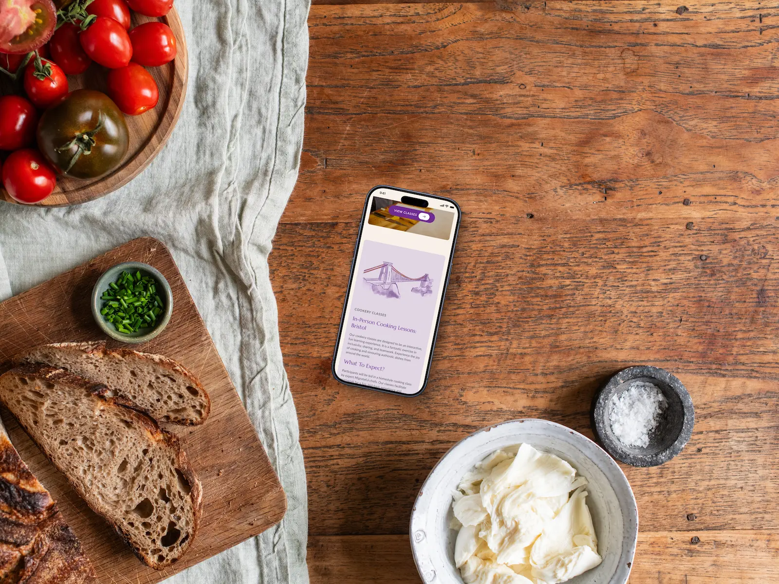
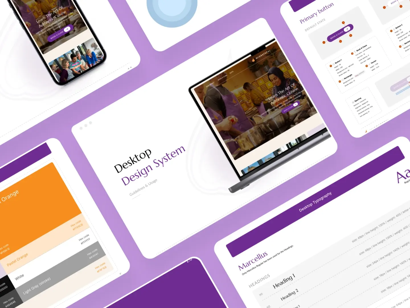
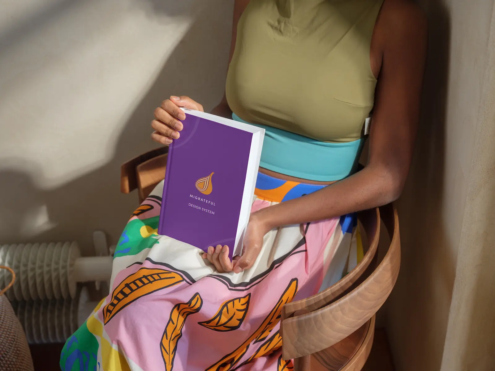
The visual system leaned into the premium positioning the client wanted: confident serif headings, a restrained purple and orange palette, and real photography over stock or illustration wherever possible.
Conclusion
I don't have a launch date, traffic, or conversion numbers from this engagement, so I'm not claiming an outcome I can't support. What I can point to is a genuinely collaborative process, the client's detailed, page-by-page feedback (naming exact problems, citing specific competitor sites) carried through into real copy and structure across the homepage, About Us, Meet the Chefs, Impact, and Donate.
The client had already thought through their own positioning before I got involved, a charity insisting it should look like a premium hospitality brand rather than a typical nonprofit. My job was translating that specific, sometimes counterintuitive instinct into consistent copy and structure, not inventing a direction from scratch.